Creating A Progress Bar In Excel
Progress Bars are simple graphics that can be quite visually powerful by instantly providing detail to your audience on how close your team might be to completing a goal or task. Currently, there is no “Progress Bar” chart type in Excel, so we as users have to use a little creativity to build one.
By the end of this tutorial, you will be able to not only build a chart that tracks progress, but it will look amazing as well! So let’s get into it!!
Get This Tutorials Example File:
If you would like to see the finished solution inside a live Excel spreadsheet, I have added an example file with various progress bar examples to my Example Files Vault. You can gain instant access through subscribing to my free email newsletter. Click the button below to quickly get signed up (only first name and email address required).

Already Subscribed? Click HERE to log-in to the "Example Files" section
The Spreadsheet Setup
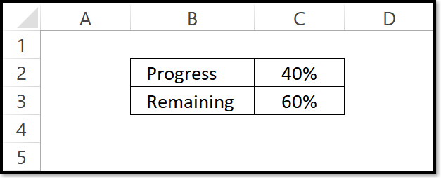
The spreadsheet cell setup is fairly simple since you only need two figures: your progress complete % and your progress remaining %. Chances are the progress complete % is going to be calculated in a unique way, so I’ll let you figure out how to get it calculated. The remaining % calculation can just be a simple formula of 1 - Progress %. No matter what, you two percentages need to equate to 100%.
Inserting Your Chart
To insert the proper chart type, first select your two percentage cells (in the example cells C2 and C3). Next, go to the Insert Tab and click the Change Settings button in the corner of the Charts group.

The Insert Chart dialog box will open and you will need to navigate to the All Charts tab. Select the following Stacked Bar configuration and click OK.

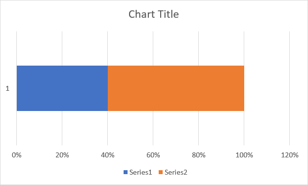
After you have clicked OK in the Insert Chart dialog box you should see a chart inserted into your spreadsheet that looks similar to the following.
Formatting Your Chart
Now that you have the structure of your progress bar chart complete, well will need to dress it up a bit to make it look more professional and intuitive.
01. Change The Fill Format
First, let’s select each section of the bar chart and change the fill color. I recommend using a dark color for the progress section and a lighter color for the remaining section. If you would like a tool that can easily create a lighter color based on another color, check out the lighten button in the myBrand Excel Add-in.

02. Add A Border Color
Next, let’s add a border (Excel refers to this as a Shape Outline). The border color should be the exact same color as your progress section color.

You’ll need to add this border to both sections of your bar chart. You can play with the thickness of your applied borders by modifying the Weight property.

03. Add A Data Label
Next, you will need to add a chart Data Label to indicate the current progress. This will be a little tricky so make sure you pay attention to the following steps.
Select the Remaining section bar only and right-click. You should see an option towards the end to Add Data Labels.
After you’ve inserted your data label, right-click on the label and select Format Data Labels (towards the bottom of the menu).
You should see the Format Data Labels pane appear on the right-hand side of your screen. Change the Label Position property to equal Inside Base.
Continue to format the color and size of your data label to match your style. I recommend using a dark grey color and bolding the label font.

Linking The Data Label
You might have noticed the data label is displaying your remaining percentage and not your progress %. To change this, click on your data label until the label is surrounded by white circles. Next, click into the formula bar and navigate to the cell containing your progress percentage. Select that cell and hit your Enter key on the keyboard. You should see your percentage change to match your progress value.
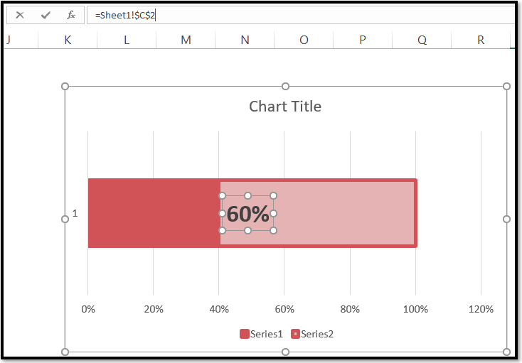
04. Constrain The X-Axis Range
Next, we’ll tweak the x-axis range so that we are only displaying points between 0% and 100%. This can be done by right-clicking on the x-axis and navigating to the Format Axis pane. Turn the Maximum value static by changing from “Auto” to 1.0 by typing 1 into the value field.

05. Clean Up The Chart Area
Finally, we’ll do some final touch-ups to make our progress bar less “chart-y” in appearance. I recommend you remove all the chart elements besides the data label.

Your Progress Bar Is Complete!
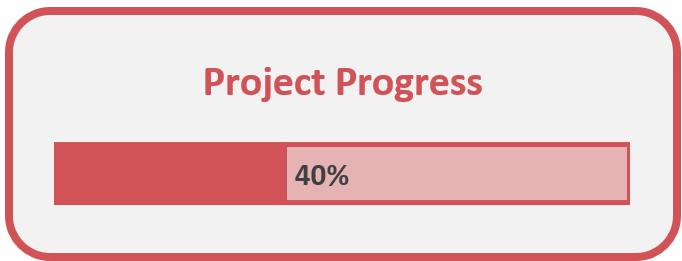
That’s it! You have built a modern, professional-looking progress bar that you can place into a dashboard or on a PowerPoint slide.

Add Even More Creativity!
Now that you have the structure of your Progress Bar built, you can play with the format to make it match your design style. Here are a few things you can do to further enhance your Progress Bar Chart.
Tweak the Border Color
An easy way to change the look of your progress bar outside of changing the colors is to modify the border color. Below are two examples of how either using a bold/dark color or matching the background color can make the progress bar look a little different. You can also play with the board weight (thickness) to achieve your end result.

Add 100% Complete State Logic
One thing I didn’t appreciate with my initial build of the Progress Bar chart was the appearance of the graphic when one achieved 100% completion. As you can see below, the data label looks a little bit awkward.

In order to fix this, I added two dedicated cells to feed the data label values (cells N2 and N3 below). I used the following formulas to change the values based on if the Progress value (cell L2) reached 100%.
Cell N2 Formula: =IF(L2<>100%,L2,"")
Cell N3 Formula: =IF(L2=100%,"100% Complete!","")
So what I did was select the dark red Progress Section and added a data label to it as well. I re-linked both data labels to point to Cell N2 and Cell N3 respectively. I also formatted the Progress Section’s data label to have white font.

With the applied formula logic, only one data label with have a value and the other will look invisible because it will have an empty value (the double quotes). The end result gives a much better 100% end-state in my opinion.

How Do I Modify This To Fit My Specific Needs?
Chances are this post did not give you the exact answer you were looking for. We all have different situations and it's impossible to account for every particular need one might have. That's why I want to share with you: My Guide to Getting the Solution to your Problems FAST! In this article, I explain the best strategies I have come up with over the years to getting quick answers to complex problems in Excel, PowerPoint, VBA, you name it!
I highly recommend that you check this guide out before asking me or anyone else in the comments section to solve your specific problem. I can guarantee 9 times out of 10, one of my strategies will get you the answer(s) you are needing faster than it will take me to get back to you with a possible solution. I try my best to help everyone out, but sometimes I don't have time to fit everyone's questions in (there never seem to be quite enough hours in the day!).
I wish you the best of luck and I hope this tutorial gets you heading in the right direction!
Chris
Founder of TheSpreadsheetGuru